Your email can be perfectly written — but if the call to action falls flat, the whole thing stalls. The best CTAs are tailored to what the user’s done, what they need next, and what feels natural in the moment.
Great CTAs don’t always say “Buy now” or “Start free trial.” Sometimes it’s “See what’s new,” “Pick your plan,” or “Get the report.” Just one line that makes clicking feel easy.
In this post, you’ll find 15 CTA examples from SaaS emails — real copy, real buttons, and ideas you can use to get more clicks without trying harder.
Let’s take a look.
Contents
What is a CTA in Emails?
Answer: A CTA (Call to Action) in an email is the button or link that tells the reader exactly what to do next — whether that’s starting a trial, booking a demo, or checking out a new feature.
It’s the most important part of your email. A good CTA turns attention into action. It gives the reader clarity, urgency, and a clear path forward — all in a few words.
Even small tweaks to your CTA can lead to big gains in clicks, conversions, and product engagement.
Why Do CTAs Matter in SaaS Emails?
Answer: The CTA is where the click happens. If your email gets opened and read but the CTA flops, the whole message fails.
Whether you’re sending onboarding flows, newsletters, promos, or reactivation emails, the CTA needs to be strong, clear, and conversion-focused.
1. CTAs move the reader from passive to active
Without a strong CTA, emails just get read and forgotten. The right words get people to act—now, not later.
2. Your CTA drives your core metric
Want more demo bookings? More product usage? More upgrades? It all hinges on the CTA. That’s the moment that turns engagement into outcome.
3. Testing CTAs can unlock quick wins
You don’t need to redesign your emails. Sometimes changing “Learn more” to “Start your free trial” can lift clicks instantly. Great CTAs are low-effort, high-impact.
When Should You Use Strong CTAs in SaaS Emails?
Answer: You should use clear, action-driven CTAs in every SaaS email that has a goal attached to it — whether that goal is engagement, activation, conversion, or retention.
Not every email needs to sell. But every email should lead somewhere.
1. In onboarding emails to drive product usage
Your onboarding emails set the tone for the entire user experience. This is where you guide people from “just signed up” to “active and seeing value.” A strong CTA here helps new users take the next logical step—whether that’s importing data, creating their first project, or setting up an integration.
Without a clear CTA, users might get stuck or overwhelmed. But with a single, well-placed action—like “Connect your account” or “Launch your first campaign”—you reduce friction and drive early wins that lead to long-term retention.
2. In promo emails to encourage upgrades or purchases
If you’re offering a time-sensitive deal, new plan, or limited-time discount, the CTA is everything. These emails need to drive urgency—and the CTA should match that energy. Phrases like “Upgrade now and save 30%” or “Claim your bonus features” tell the reader exactly what they’re getting and why they should act now.
The more direct and benefit-focused your CTA, the higher the chance someone clicks through. It’s not about being clever—it’s about being clear and compelling at the exact right moment.
Want Black Friday inspiration? These 22 SaaS email examples are built around urgency and high-impact CTAs.
3. In newsletters to get clicks on featured content
SaaS newsletters often highlight new blog posts, features, webinars, or product tips. But just dropping in links isn’t enough—you need CTAs that tell the reader what’s in it for them. A good CTA like “Read the full guide” or “Watch the 5-minute walkthrough” makes the email feel more valuable and gives it direction.
Your newsletter’s job is to drive traffic or engagement. Strong CTAs help you turn passive readers into active clickers—especially when your content solves a real pain point.
Got a product launch coming up? Here are 30 real SaaS ProductHunt email examples that drove clicks.
4. In reactivation emails to pull users back in
If someone’s gone quiet—stopped logging in, paused their subscription, or ghosted their trial—a reactivation email with a sharp CTA can re-open the door. This is where you want to make it easy for them to re-engage. CTAs like “Pick up where you left off” or “Reboot your free trial” feel low-pressure but actionable.
Timing and tone matter here. You’re not pushing—they’re being invited back, and your CTA should reflect that sense of ease and welcome.
On the flip side, if you’re sunsetting a feature or a plan, you’ll need just the right tone. Here are 11 sunset email examples to guide you.
5. In feedback emails to capture user input or NPS scores
Feedback emails usually ask for one small action—answer a question, rate an experience, or fill out a short survey. The CTA should be frictionless and clear: “Take the 30-second survey” or “Rate your experience” are far more effective than generic links.
When users see a low-effort CTA that tells them exactly what to expect, they’re more likely to click—and actually complete the action. These small signals add up to big insights that help you improve the product.
Pro Tip: Even subtle emails (like product updates) benefit from a focused CTA. It gives the reader direction — and gives your email a clear reason to exist.
Listed: Great Call To Action Examples From 15 Real SaaS Emails
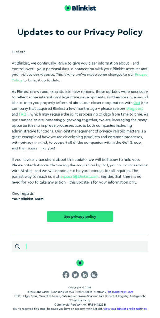
1. Blinkist – See privacy policy
This email from Blinkist isn’t about driving conversions or product use—it’s all about transparency. The CTA “See privacy policy” gives subscribers an easy way to check what’s changing without forcing them to scroll through legal jargon. It’s direct, respectful, and gives the reader full control. This kind of CTA is often used in compliance emails, data collection updates, and GDPR notifications.
Other CTA ideas:
- View our updated policy
- Learn what’s changing
- Review your settings
- Check your data rights
- Read the update
Why it works:
There’s no fluff. This CTA respects the reader’s time and their inbox. It doesn’t try to “sell” anything—it just says what it does and does what it says.
Found the perfect CTA? Now check out these privacy policy email templates you can copy.
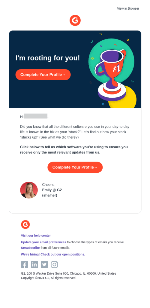
2. G2 – Complete your profile
G2’s email nudges users to fill out their profile so they can personalize the software recommendations they receive. The CTA “Complete Your Profile →” is warm and encouraging, matching the friendly tone of the headline (“I’m rooting for you!”). This CTA is great for onboarding emails or first-time user follow-ups.
Other CTA ideas:
- Tell us what tools you use
- Update my software stack
- Personalize my experience
- Set up my profile
- Finish onboarding
Why it works:
It feels like a favor, not a task. G2 ties the action to a benefit (more relevant updates), which makes the CTA feel useful—not like work.
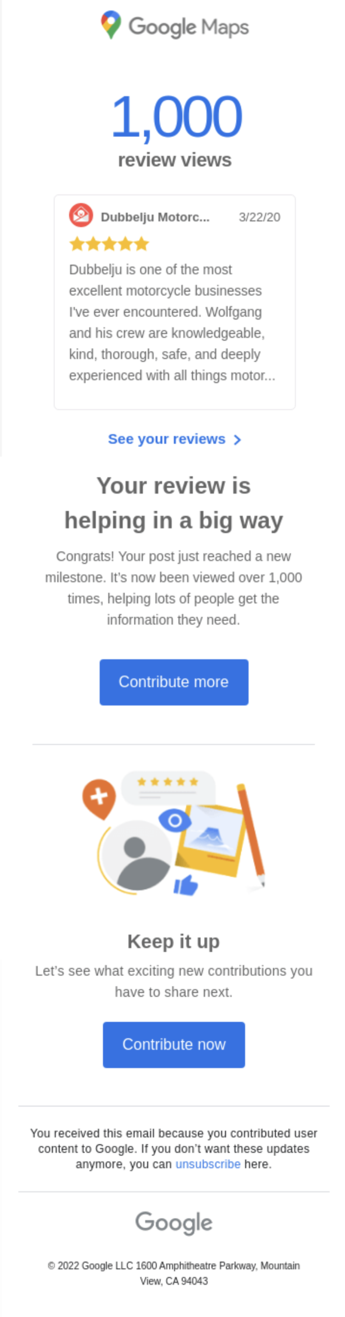
3. Google Maps – Contribute more
This is a milestone-based email: you hit 1,000 review views, and Google wants to encourage you to keep going. “Contribute more” is the kind of CTA that works well for community-based platforms. It speaks to a sense of purpose rather than a transaction.
Other CTA ideas:
- Write your next review
- Keep the feedback coming
- Share more insights
- Help others with your tips
- Add your next favorite spot
Why it works:
It taps into social proof. If your review helped thousands, why stop? This CTA builds momentum and makes the user feel valuable.
4. Harvest – Reactivate your trial
Harvest’s re-engagement email gives you a nudge to pick up where you left off. The CTA “Reactivate your trial” is urgent without being pushy. It works because it assumes you already saw value—this is just a reminder to come back.
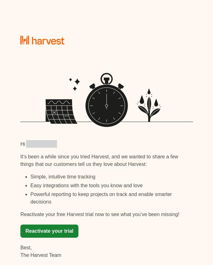
Other CTA ideas:
- Pick up where you left off
- Try [CompanyName] again
- Continue your free trial
- Get back to tracking time
- Reopen your account
Why it works:
It lowers the barrier. The word “reactivate” feels like flicking a switch—not starting over. That’s a powerful way to reduce friction.
5. Miro – Start Creating
This email from Miro is a classic example of a friendly welcome that drives action right away. Instead of dumping too much info upfront, it gives users one clear action: “Start creating”. Everything else—like step-by-step guidance, videos, and community links—comes after that first push. This keeps the message focused and easy to act on.
The email also repeats the CTA in different sections (start your board, invite your team, explore tutorials), which builds momentum without feeling too salesy. Great structure for onboarding emails that want to nudge users without overwhelming them.
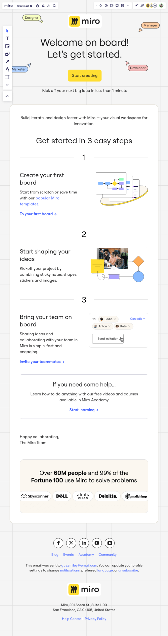
Other CTA suggestions similar to “Start creating”:
- Start designing/building/listening (or any action related to your product)
- Start your first board
- Jump into your workspace
- Create something now
- Let’s build your first idea
- Explore your tools
Why it works:
This CTA removes friction. It’s short, clear, and action-oriented, with no fluff. By leading with it and backing it up with step-by-step guidance, the email makes the user’s next move feel obvious and easy.
6. Rawpixel – Invite more friends
This referral email is light, personal, and framed as a gift. The CTA “Invite more friends” keeps the energy playful and makes the reward feel easy to get. It’s a great example of how referral CTAs can be direct but still friendly.
Other CTA ideas:
- Share your invite link
- Earn your free membership
- Refer your friends now
- Send an invite
- Start referring
Why it works:
It sounds like something you’d say in real life. There’s no “claim your referral bonus” language—it’s just about sharing.
7. Shopify – Read more
Shopify’s blog newsletter uses a minimalist CTA—“Read more.” In this context, it’s totally fine. The focus here is on educating users, not driving product action. That’s why the CTA is calm, clear, and low-friction.
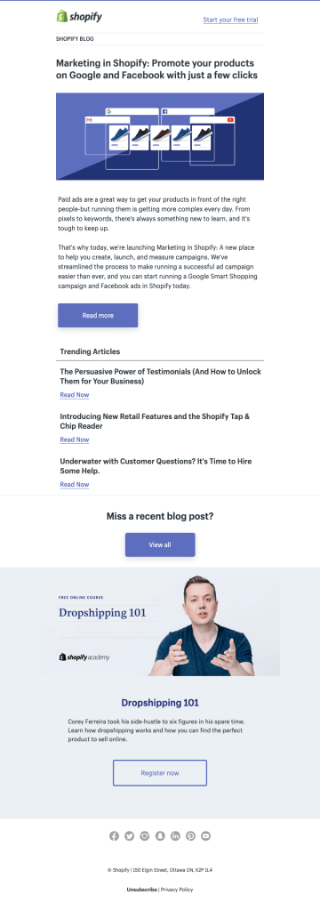
Other CTA ideas:
- Keep reading
- See the full guide
- Explore the article
- Learn more about ads
- Continue reading
Why it works:
It meets the reader where they are. If they’re interested in the topic, they’ll click. If not, the CTA doesn’t push them.
8. Skillshare – Use your discount
This is a classic limited-time offer email. The CTA “Use Your Discount” feels personal—it’s not just “Buy now,” it’s “take what’s yours.” This phrasing works especially well in seasonal promos and renewal emails.
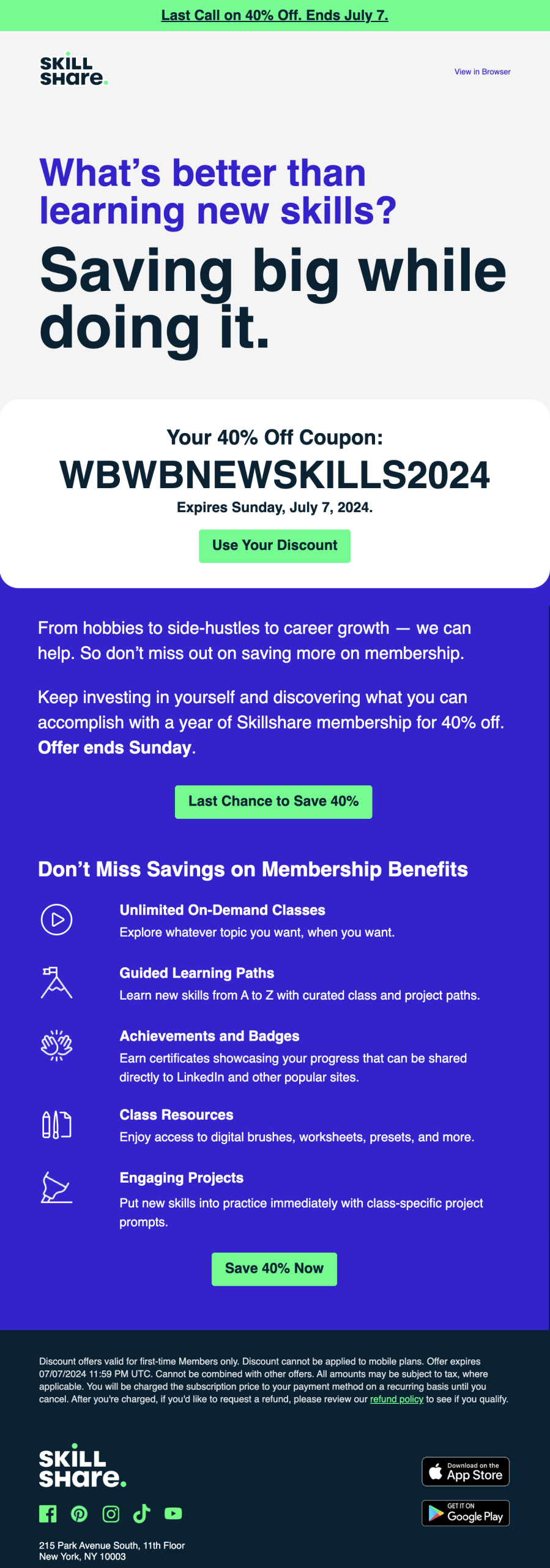
Other CTA ideas:
- Claim your 40% off
- Save before it ends
- Apply discount now
- Use your coupon
- Get the deal
Why it works:
It creates ownership. Instead of just promoting the offer, the CTA makes it feel like a gift you’ve already earned.
9. Userback – Upgrade Account
A no-nonsense CTA for a very specific moment—your trial’s about to end. “Upgrade Account” doesn’t over-explain or over-sell. It’s a friction-free, high-intent CTA that respects the user’s familiarity with the tool.
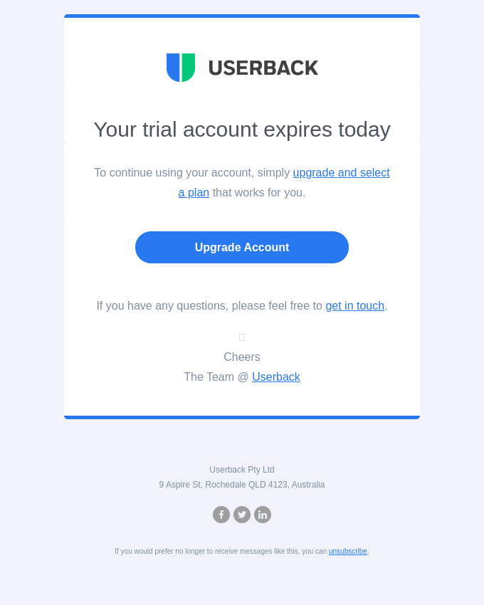
Other CTA ideas:
- Choose your plan
- Keep your access
- Go premium
- Subscribe now
- Upgrade your trial
Why it works:
It cuts to the point. No fluff, no fluffiness—just a clear ask when the user already knows what’s happening.
Need upgrade-specific copy? These 4 email templates cover examples that convert.
10. Beefree – Start designing
Beefree’s email teases templates for every season. The CTA “Start designing” is an action-oriented phrase that speaks directly to their core user base: people who want to make something. This kind of CTA is great for creative tools and builder platforms.
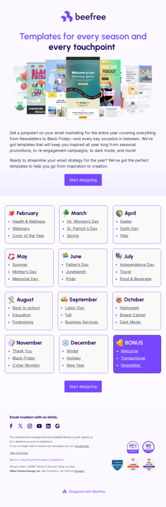
Other CTA ideas:
- Explore the templates
- Design your next email
- Jump into the editor
- Get inspired
- Build something now
Why it works:
It’s exciting and practical. It promises action without needing a full explanation—and matches the playful tone of the email.
11. Webflow – Register now
This community email from Webflow invites users to a live event called “Coffee Talk.” It’s casual and friendly, but still has real value: expert insights from leaders at Help Scout, Lattice, and Webflow. The CTA “Register now →” is simple and timely, encouraging readers to grab a seat while the event’s still open. These types of CTAs work well in webinar invites, live demo announcements, or virtual Q&A sessions.
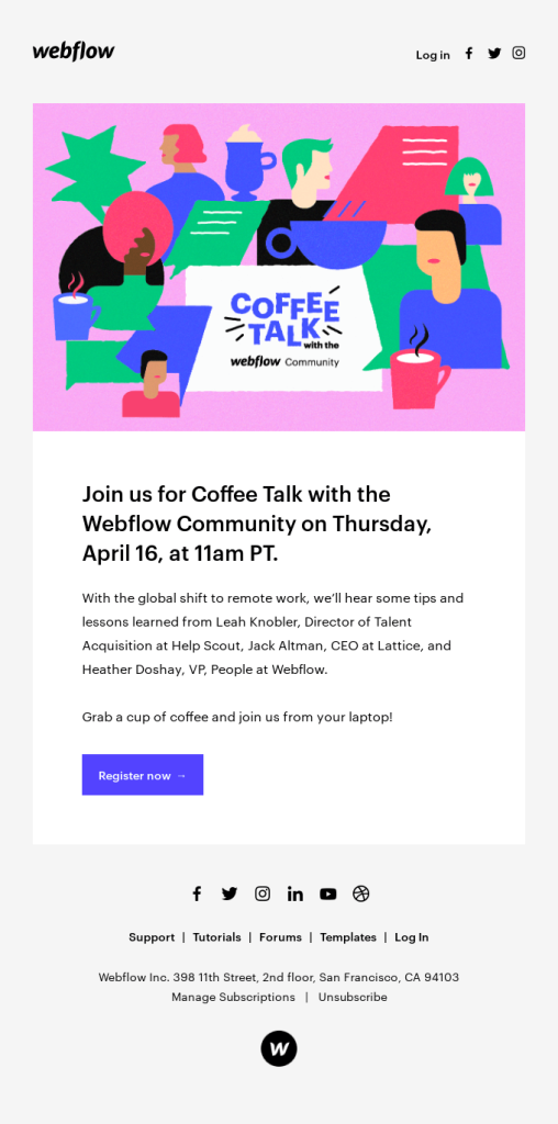
Other CTA ideas:
- Save your spot
- RSVP for the event
- Join the live talk
- Book your seat
- Add to calendar
Why it works:
It’s low-pressure, but still timely. The copy is conversational (“grab a cup of coffee”), and the CTA matches that tone—making the invite feel personal instead of promotional.
12. Lulu – Start a new project
This CTA appears at the top of Lulu’s onboarding email for creators. It’s the classic “get started” button, but framed in a way that sounds more exciting and action-based. The email guides users through the next 3 steps in the process of self-publishing, so the CTA acts like a green light.
This kind of CTA works well for onboarding flows, where people might have signed up but haven’t yet done anything meaningful. It reduces friction and gives direction, instead of leaving users guessing what to do next.
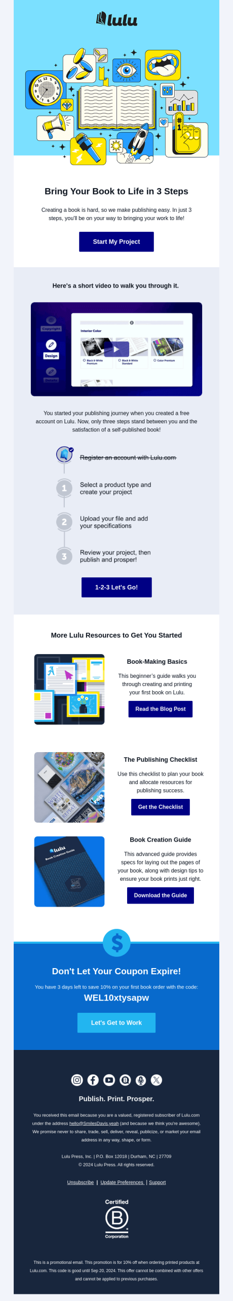
Other CTA suggestions:
- Start creating your book
- Begin your journey
- Build your project now
- Take the first step
- Let’s get started
Why it works:
It focuses on action without being pushy. “Start My Project” is personal and positive — it tells the user what’s waiting for them without needing to explain much. It’s beginner-friendly and lowers the barrier to action.
13. Microsoft – Learn about Copilot+ PCs
Microsoft’s email doesn’t ask for a direct sale. Instead, the CTA leads to a deeper product explainer. For a new category like “Copilot+ PCs,” it makes sense to slow down the pitch and let the email educate first.
The whole message builds curiosity about the product. Once users understand what it is, the CTA invites them to keep reading, not buy right away. This is ideal for higher-ticket or unfamiliar products.
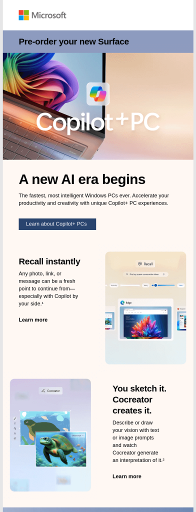
Other CTA suggestions:
- Explore [new feature]
- See how it works
- Discover the new Surface
- Learn what’s new
- Get the details
Why it works:
It builds trust before asking for a commitment. For big launches or expensive tools, people need context first. A learn-focused CTA gives room to explore without pressure.
14. Miro – Take the survey
Another one from Miro — this feedback email goes for a simple, no-fluff CTA: “Take the survey.” It’s short, honest, and direct. The design around it is friendly, and the copy makes it clear this won’t take more than 5 minutes.
For any product team looking to collect insights, this kind of CTA is gold. It works because it doesn’t over-sell. It feels more like a small favor than a corporate request — which makes people more likely to say yes.
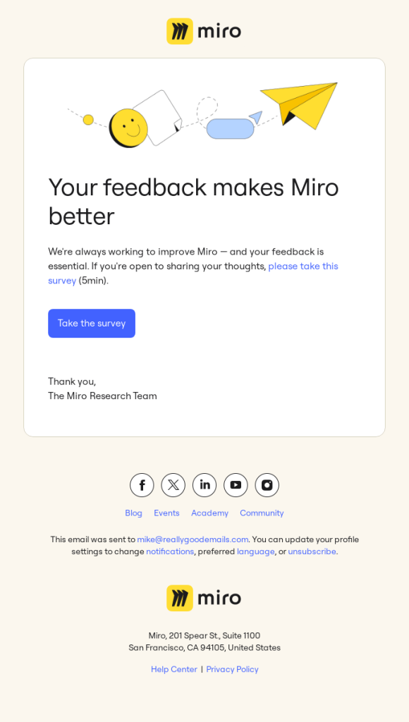
Other CTA suggestions:
- Share your feedback
- Tell us what you think
- Help us improve
- Answer 5 quick questions
- Complete the short survey
Why it works:
It feels human. There’s no fake urgency or reward — just a gentle, respectful ask that puts the user in control. Perfect for companies with loyal user bases who want to build better experiences.
15. Asana – Get the Secret
Asana uses a playful, curiosity-driven CTA here: “Get the Secret.” It doesn’t tell you exactly what the content is — instead, it teases the benefit of reading the productivity tips shared by their co-founder. This kind of CTA leans on intrigue rather than clarity, which can work well if the headline and body already hint at the value.
In this case, the email is part of a series of educational content about work habits. So instead of saying “Read the article” or “Learn more,” they’ve gone for a CTA that feels more personal and discovery-oriented.
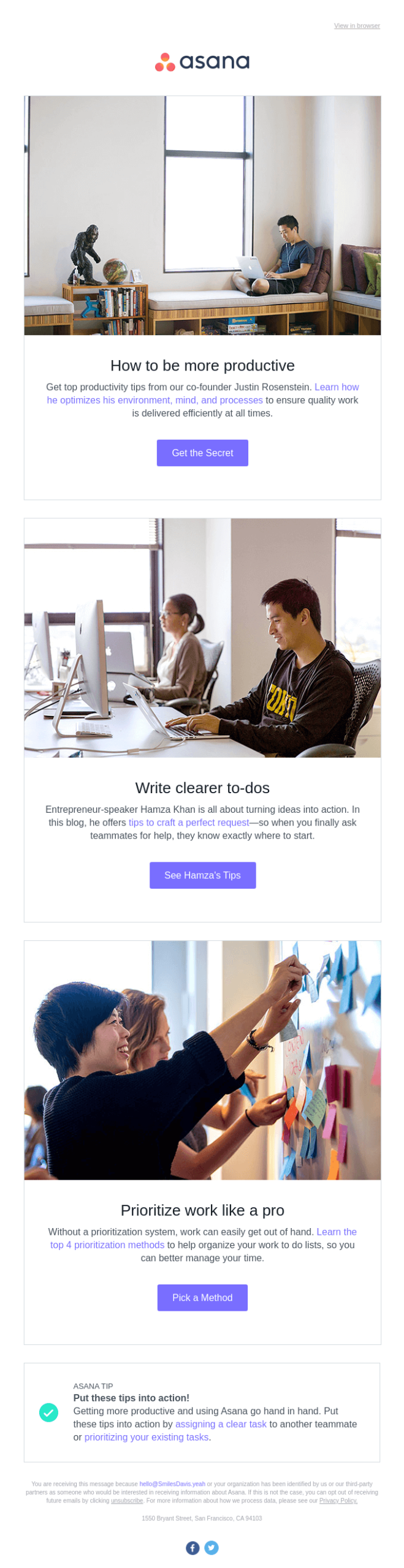
Other CTA suggestions:
- Discover the secret
- Unlock the tip
- Read Justin’s advice
- See how he works
- Reveal the secret
Why it works:
It’s all about curiosity. This CTA makes you feel like you’re getting access to something exclusive. That’s a great tactic for blog content or thought leadership — especially when it’s tied to a known figure like a company founder.
How to Improve Your SaaS Email CTAs
Make it action-first
A great CTA starts with a verb. “Start your free trial,” “Get the report,” “See it in action” — these drive clicks way better than generic buttons like “Submit” or “Click here.”
Match the CTA to the email’s goal
Every email has one job. Make sure the CTA supports that one goal, whether it’s booking a demo, upgrading a plan, or exploring a new feature.
Keep it short and specific
4–5 words max is the sweet spot. Be clear, not clever. “Try Pro free” beats “Unlock your future potential.”
Use benefit-driven language
Instead of just telling people what to do, show what they get. “Save my spot” sounds better than “Register now.” It puts the reward in focus.
Don’t distract with too many buttons
One email = one CTA. If you need more, stack them in priority. But your main button should be obvious, bold, and stand alone. Less choice = more clicks.
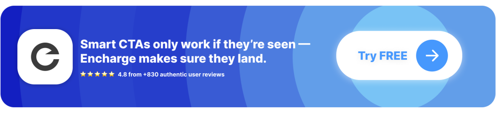
A strong CTA doesn’t matter if the timing’s wrong
→ Encharge makes sure the right person sees it at the right time.
The best CTAs don’t just live inside pretty emails — they’re triggered by what users do. Encharge helps you send emails with context-aware CTAs that convert, because they match where the user actually is in their journey.

- Trigger CTA-driven emails based on behavior, lifecycle stage, or plan
- Personalize actions: upgrade, book a call, explore a feature — whatever fits
- A/B test CTAs and see what actually moves users
- Works with your CRM, product data, and email — all in one
- Trusted by 1,000+ SaaS teams to drive next steps that matter
A good CTA grabs attention. A well-timed CTA drives growth. Encharge helps you do both.
FAQ for email CTA examples for SaaS
1. What makes a good CTA in a SaaS email?
A good CTA (call-to-action) in a SaaS email is clear, action-driven, and tied to a specific outcome. It should tell the reader exactly what to do next—no fluff, no guessing. With Encharge, you can A/B test CTA text and placement to see what drives the most clicks.
How to craft a strong CTA:
- Use direct language like “Start Free Trial” or “Book a Demo.”
- Tie the CTA to a benefit (e.g. “Get More Leads”).
- Keep it visually clear with a button or standout link.
2. How many CTAs should I include in one SaaS email?
For most SaaS emails, one primary CTA is best. Too many options can create confusion and reduce clicks. If you add a secondary CTA, make sure it doesn’t compete with the main action. Encharge lets you track which CTA gets clicked and refine from there.
How to structure CTA usage:
- Focus on one clear action per email.
- Place the CTA early, then repeat it at the bottom if needed.
- Monitor clicks in Encharge to optimize layout.
3. Where should I place the CTA in an email?
The most effective CTAs usually appear above the fold (near the top), but repeating it once near the end can help skimmers. Make sure it’s clearly visible and surrounded by white space. Encharge allows you to test different placements and analyze the results.
Best placement tips:
- Insert your primary CTA right after the value statement.
- Repeat it once if the email is long.
- Test placement in Encharge to see where it performs best.
4. Should I personalize CTAs in SaaS emails?
Yes—personalized CTAs can boost engagement by making the message feel more relevant. You can tailor the text, destination, or even the CTA type based on user role, plan, or activity. Encharge makes this easy with dynamic content and segmentation.
Ways to personalize:
- Use merge tags like “Start your {planName} trial.”
- Match the CTA to user behavior (e.g. “Try this feature again”).
- Dynamically change the CTA link with Encharge based on user profile.
5. Can CTA design impact click rates?
Absolutely. Button color, size, and spacing all impact how clickable a CTA feels. Even subtle tweaks can move the needle. With Encharge, you can A/B test design variations across different segments to optimize performance.
CTA design best practices:
- Use contrasting colors that stand out from the background.
- Make the button large enough to tap on mobile.
- Avoid clutter—give the CTA room to breathe.